What 5 mistakes do you need to avoid when creating a landing page? In this blog post, we will discuss 5 mistakes that can hurt your conversion rates and kill your profits. We’ve seen it happen before – businesses spend time on their website only to have the conversion rate suffer as a result of not paying attention to these 5 simple things.
1. Less or Inaccurate Information
The most common mistake businesses make is not creating enough helpful material before asking visitors to opt-in or purchase their product/service. Be careful of using “weasel words” like “try,” “start,” or even worse – offering nothing but an email signup form straight away (you need reasons why someone should give up their personal details).
Another big mistake is creating a landing page that’s too salesy. We’ve all been there before – we click on an interesting link and end up watching 5 minutes of video or reading 5 paragraphs about the product/service only to realize it’s more information than what we’re looking for. The last thing you want visitors doing is scrolling back up and clicking out of your site because they feel like they’re being overloaded with marketing messages!
2. BAD DESIGN
Avoid having multiple CTAs on one landing page. If you’ve ever clicked through an ad only to land on a generic lead capture page where there were 5 different calls-to-action asking for 5 different things, i.e., newsletter signup, free consultation request, etc., you know how frustrating it can be to not land on the page you were expecting.
Your form or CTA should be placed in an easily reachable location so that visitors can find it right away. If you bury the call-to-action, they’ll have a harder time following through with their intentions of completing it. Forms are typically on one side for basic information and contact details while another displays buttons at higher up toward to top right corner which may prompt them more frequently.”
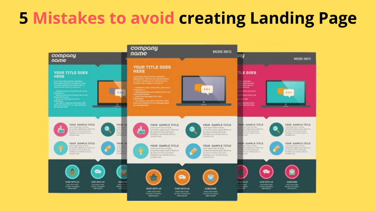
Mastering landing pages require so much experience and knowledge. If you want to learn everything about landing pages, make sure to check out our course. We have covered everything from A-Z and will not need any further knowledge after watching this course. Check out by clicking here.
Distraction-free landing page designs have the power to capture and hold your audience’s attention. However, if you want them engaged enough for conversion rates, it is important not only that no distractions exist but also that any friction-reducing user experience isn’t present either!
Landing pages should be designed to attract specific site visitors and motivate them to complete a call-to-action (for example, make an appointment or request more information). If your lead generation website is targeting different types of clients but has one generic page for all potential customers, you’ll likely lose traffic quickly as users bounce from the page without converting into leads.
3. Catch Attention
Don’t try to do everything at once on your lead capture form. You probably know that it can take 5 – 15 seconds for someone to decide whether they’re going to trust your brand enough to give you their email address. This means if they don’t immediately see what’s in it for them – not what you’re offering but how giving you their email address will benefit THEM – they’re never going to give it.
Don’t overwhelm your landing page with too much information or content that doesn’t relate directly to the offer you are making on the CTA button. Many people make this mistake and end up confusing site visitors so much they either leave without taking any action at all (increasing bounce rate) or filling in some of the form fields but not others (decreasing conversion rate).
All the website traffic in the world won’t make a difference if site visitors don’t do what you want them to. This could mean making a purchase, registering for an event, subscribing to your content, or requesting more information about a product or service. A landing page sometimes called a lead page, is the page on your website that appears when a user clicks on a paid advertisement or search engine result.
4. NO FOLLOW UP
The user should be reminded of why they shared their information and what will happen next. The thank you message, or any other communication after the fact, can include a link to content that was downloaded as well as for instructions for getting in touch with them again if necessary!
5. INCLUDING NAVIGATION
It is essential to have a clear journey on your landing page. As visitors navigate through different sections of the site, they should be able and eager (in case you want them) for one specific action, such as conversion into an actual customer!
As opposed to a typical website, which can have many different paths for visitors and thus lead them away from conversion, a landing page should do everything in its power not to let users leave this webpage disappointed by providing clear direction – you want them taking one step at first so that their journey doesn’t end here!
You can increase the conversion rates on your website by making sure that you’re avoiding these common mistakes. Avoid landing pages with errors, content not optimized for search engines, and be engaging in a tone of voice when speaking or writing. New to this topic? Here we have made an outstanding course for beginners like you to start off your journey very quickly and easily. Click here to see our course outline. You will love it for sure!